

Most people may only associate data modeling such as linear regression with Python or R, but can SQL be effective in achieving similar results? It's worth taking a deep dive into both methods and comparing and contrasting them.
The dataset we will be using is the Transactions from a Bakery dataset from Kaggle. There are 21,293 rows of data and contains four columns (Date, Time, Transaction, and Item). I have added a fifth column (ID), which will serve as the unique primary key for our analysis. For our linear regression analysis, we will be utilizing Date as the x-axis and the total transactions for the day as the y-axis. Here is what a sample of the data looks like:

Linear Regression Equation
It is first and most important that we understand the equation for linear regression:

This is where y is the dependent variable and x is the independent variable. Slope is represented by m and intercept is represented by C. Furthermore, we know that the following is true:

SQL
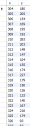
Before we can do any analysis, we need to get a count of all the transactions from each particular day. We can do so by running this SQL code:
SELECT
	date,
    COUNT(ID)
FROM sales
GROUP BY date;
Which yields this table:

Now we must convert the Date column into a single number because the formula we will be using can only take integers, not date formatted data. We will also go ahead and rename our columns into x and y for easier understandability and readability later. This can be done using a case statement, such as the following:
SELECT
    CASE
		WHEN DAYOFYEAR(date) < 100 THEN DAYOFYEAR(date)+365
        ELSE DAYOFYEAR(date)
    END as x,
    COUNT(ID) as y
FROM sales
GROUP BY CASE
		WHEN DAYOFYEAR(date) < 100 THEN DAYOFYEAR(date)+365
        ELSE DAYOFYEAR(date)
    END;
This is the result:
Now that we have our x and y points, we can begin the regression. First is to find the intercept and slope of the linear regression equation. We can calculate x bar and y bar with the following query:
SELECT
	a.x as x, AVG(a.x) OVER() as x_bar,
	a.y as y, AVG(a.y) OVER() as y_bar
FROM
	(
	SELECT
		CASE
			WHEN DAYOFYEAR(date) < 100 THEN DAYOFYEAR(date)+365
			ELSE DAYOFYEAR(date)
		END as x,
		COUNT(ID) as y
	FROM sales
	GROUP BY
		CASE
			WHEN DAYOFYEAR(date) < 100 THEN DAYOFYEAR(date)+365
			ELSE DAYOFYEAR(date)
		END
	) a;
Slope and intercept can be found using this query:
SELECT
	c.slope,
    c.y_bar_max - c.x_bar_max * c.slope as intercept
FROM
	(
	SELECT
		SUM((b.x-b.x_bar)*(b.y-b.y_bar))/SUM((b.x-b.x_bar)*(b.x-b.x_bar)) as slope,
		MAX(b.x_bar) as x_bar_max,
		MAX(b.y_bar) as y_bar_max
	FROM
		(
		SELECT
			a.x as x, AVG(a.x) OVER() as x_bar,
			a.y as y, AVG(a.y) OVER() as y_bar
		FROM
			(
			SELECT
				CASE
					WHEN DAYOFYEAR(date) < 100 THEN DAYOFYEAR(date)+365
					ELSE DAYOFYEAR(date)
				END as x,
				COUNT(ID) as y
			FROM sales
			GROUP BY
				CASE
					WHEN DAYOFYEAR(date) < 100 THEN DAYOFYEAR(date)+365
					ELSE DAYOFYEAR(date)
				END
			) a
		) b
	) c;
The particular numbers for our slope and intercept are the following:

To get the points we need to plot we can run the following code. Note that there are nested CTEs in use here so that we can keep the FROM statement of the base query as clean and as readable as possible:
WITH a AS
	(
    SELECT
		CASE
			WHEN DAYOFYEAR(date) < 100 THEN DAYOFYEAR(date)+365
			ELSE DAYOFYEAR(date)
		END as x,
		COUNT(ID) as y
	FROM sales
	GROUP BY
		CASE
			WHEN DAYOFYEAR(date) < 100 THEN DAYOFYEAR(date)+365
			ELSE DAYOFYEAR(date)
		END),
slope_intercept AS
	(
	WITH a AS
		(
        SELECT
			CASE
				WHEN DAYOFYEAR(date) < 100 THEN DAYOFYEAR(date)+365
				ELSE DAYOFYEAR(date)
			END as x,
			COUNT(ID) as y
		FROM sales
		GROUP BY
			CASE
				WHEN DAYOFYEAR(date) < 100 THEN DAYOFYEAR(date)+365
				ELSE DAYOFYEAR(date)
			END)
	SELECT
		c.slope,
		c.y_bar_max - c.x_bar_max * c.slope as intercept
	FROM(
		SELECT
			SUM((b.x-b.x_bar)*(b.y-b.y_bar))/SUM((b.x-b.x_bar)*(b.x-b.x_bar)) as slope,
			MAX(b.x_bar) as x_bar_max,
			MAX(b.y_bar) as y_bar_max
		FROM
			(
			SELECT
				a.x as x, AVG(a.x) OVER() as x_bar,
				a.y as y, AVG(a.y) OVER() as y_bar
			FROM a
			) b
		) c
	)


SELECT
	a.x,
    (a.x*(SELECT slope FROM slope_intercept) + (SELECT intercept FROM slope_intercept)) as trend_line
FROM a;
This yields this table:

The last thing left to do is convert the x-axis back to a date format so we can plot it in Excel:
WITH a AS
	(
    SELECT
		CASE
			WHEN DAYOFYEAR(date) < 100 THEN DAYOFYEAR(date)+365
			ELSE DAYOFYEAR(date)
		END as x,
		COUNT(ID) as y
	FROM sales
	GROUP BY
		CASE
			WHEN DAYOFYEAR(date) < 100 THEN DAYOFYEAR(date)+365
			ELSE DAYOFYEAR(date)
		END),
slope_intercept AS
	(
	WITH a AS
		(
        SELECT
			CASE
				WHEN DAYOFYEAR(date) < 100 THEN DAYOFYEAR(date)+365
				ELSE DAYOFYEAR(date)
			END as x,
			COUNT(ID) as y
		FROM sales
		GROUP BY
			CASE
				WHEN DAYOFYEAR(date) < 100 THEN DAYOFYEAR(date)+365
				ELSE DAYOFYEAR(date)
			END)
	SELECT
		c.slope,
		c.y_bar_max - c.x_bar_max * c.slope as intercept
	FROM(
		SELECT
			SUM((b.x-b.x_bar)*(b.y-b.y_bar))/SUM((b.x-b.x_bar)*(b.x-b.x_bar)) as slope,
			MAX(b.x_bar) as x_bar_max,
			MAX(b.y_bar) as y_bar_max
		FROM
			(
			SELECT
				a.x as x, AVG(a.x) OVER() as x_bar,
				a.y as y, AVG(a.y) OVER() as y_bar
			FROM a
			) b
		) c
	)


SELECT
	DATE_ADD('2016-01-01', INTERVAL(a.x - 1) DAY) as date,
    (a.x*(SELECT slope FROM slope_intercept) + (SELECT intercept FROM slope_intercept)) as trend_line
FROM a;
Now when we plot this in Excel this is what we get:

As we can see, the trend in sales is declining as time goes on.
Python
Before any analysis can be done, we must run a few cells to import packages, run matplotlib inline, and then load the data from the csv file to a pandas dataframe:
import pandas as pd
import numpy as np
import matplotlib.pyplot as plt
import seaborn as sns
import datetime as dt
%matplotlib inlinedf = pd.read_csv('BreadBasket_DMS.csv')df.head()
Now we can begin our analysis. Let's first convert the date field from a date into a numeric field that can be used by our packages:
df['Date'] = pd.to_datetime(df['Date'])df['Date']= df['Date'].map(dt.datetime.toordinal)df.head()
As we did in our SQL example, we will gather a count of all sales grouped by our Date column:
df = df.groupby(['Date'])['ID'].count().reset_index(name="Count")df.head()
Now that we have our two columns, we can simply store them in x and y variables:
x = df[['Date']]
y = df[['Count']]
From here we can simply use seaborn's regression plot to plot out our model:
sns.regplot(x, y)
As we can see, it is an identical match to the plot we made using our SQL method.
Final Thoughts
It is certainly much easier to create a linear regression model and plot using Python, but there is something to be said about being able to create the same end product using SQL.